Click to open the Dashboard page
Click to open the Devices page
Click to open the Map page
Click to open the Alerts page
Click to open the Downloads page
Click to open the Support page
Click to open the Subscription page
Click to open the Profile page
Export The Data From Your Graphed Report
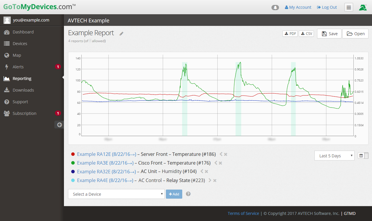
With the click of a button, export your graphed sensor data as a PDF or CSV file to meet regulatory reporting requirements or management objectives.
Easy Access To Saved Reports
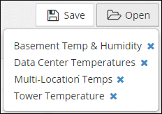
Quickly pull up saved GoToMyDevices reports for routine inspections or whenever you'd like to review data trends. Reports can be viewed from any internet-connected device, so employees and inspectors can log in from their phones, tablets, or computers to view the data.
Add A Second Y-Axis
This tool makes it easier to compare your data when graphing relays, switches, and alarms alongside temperature and humidity sensors.
Decide How You'd Like to Display Your Data
The graph automatically sets the 1st y-axis scale to display the selected sensor data. Use the arrow next to the sensor in the legend to graph the data against a second y-axis instead.
Name Your Report
Give your report a descriptive name, so it's easy to find in your list of saved reports!
Customize The Colors On The Graph
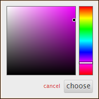
Easily change the color of sensor data on the graph! Just click on the circle next to the sensor. In the dialog box that appears, move the white bar up or down to select a color. Then move the black circle to select a shade.
View Your Sensor Data
The details for each graphed sensor are listed here and include:
- the device name (you can click on it to visit the Device Details page)
- the sensor name
- the sensor type
- the sensor's GoToMyDevices ID number
Add Another Sensor To Your Graph
Once you choose your device from the Select a Device drop-down menu, you'll see a drop-down menu with all of the unit's sensors. Choose a sensor and select +Add.
Repeat these steps for as many device/sensor pairs as you wish to see in one graph.
You can display multiple Room Alert devices in one report.
Choose Your Time Period
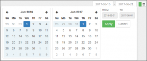
Choose a time period from the graph ranging from the last 6 hours to the last 30 days. The graph will automatically update every time you open it. You can also create a graph from historical data by selecting the calendar icon and choosing a start and end date.
Manipulate The Graph
Using reports enables managers to get the view and insight they need and want on a regular basis for better decision making, faster response, and planning. This leads to greater uptime for organizations, lower meantime between hardware failures, and smarter energy consumption. Learn how to create a report in our FAQ, How To Create A Report In GoToMyDevices.com (VIDEO).
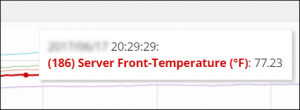
When you open a report, you can hover your cursor over the graph to bold lines and view individual readings at any point (as pictured). You can also zoom in for a detailed view of the data. Learn about other ways to manipulate the graph in our FAQ, How To Get The Most Out Of Reports In GoToMyDevices.com: Tips & Tricks (VIDEO).


